
An Indonesian Perspective: A Yield Story
Indonesia has delivered consistently for a decade, ahead of the United States and the United Kingdom. Whatever is keeping us out, it is not the yield.
The first post in this series ended on a line I keep coming back to: Australians know Indonesia better than almost any foreign market, and own less of it than almost any foreign investor.
The obvious explanation would be a lack of returns…
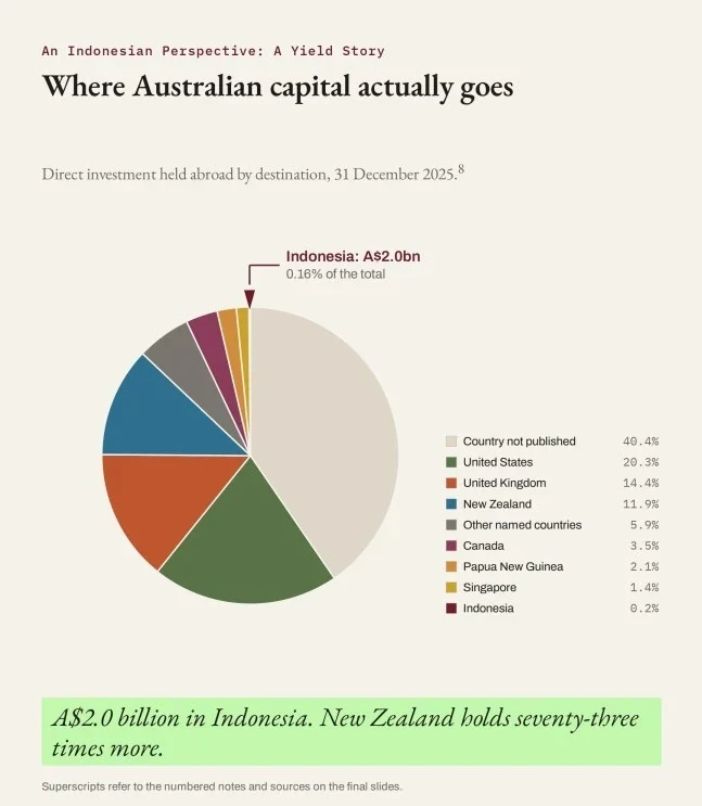
Australian capital travels perfectly well: A$1.2 trillion sat offshore in December 2025. Quite the opposite to our international travellers, it just seems to go everywhere but Indonesia. But why?
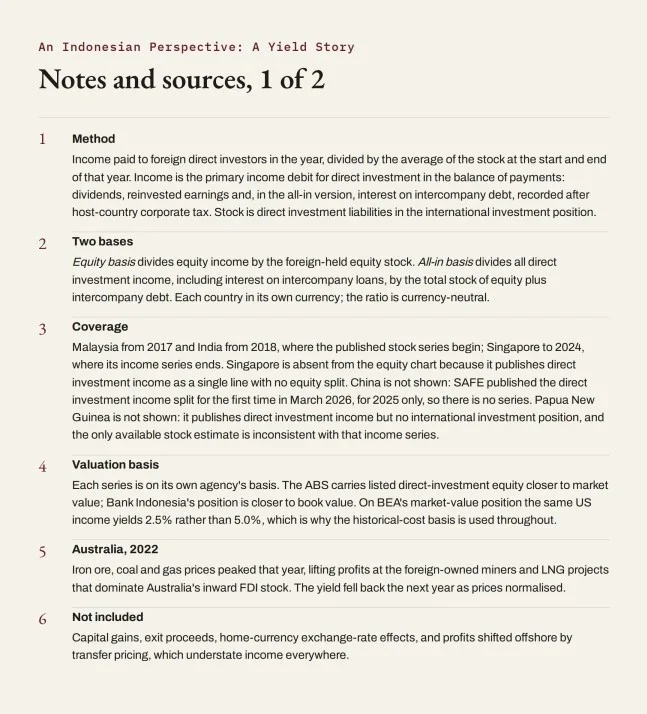
So I looked, across ten countries: Indonesia's largest investors and Australia's largest investees (plus India, the other large Asian market Australian capital weighs). China would have made eleven, but it only began publishing direct investment income in its balance of payments (BOP) this year.
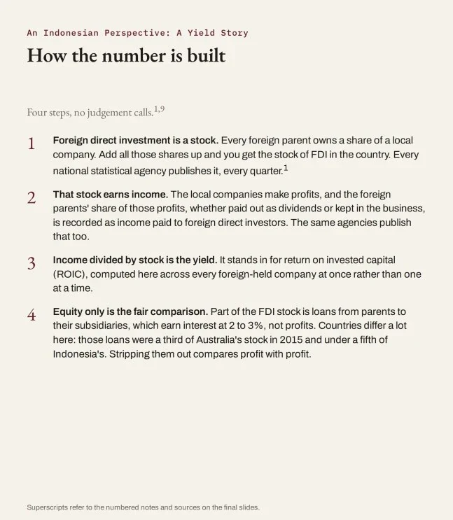
The arithmetic is simple: earnings attributable to foreign direct investors from the BOP, divided by the stock they hold there from the international investment position (IIP). Both from each country's own statistical agency, no sample, no survey.
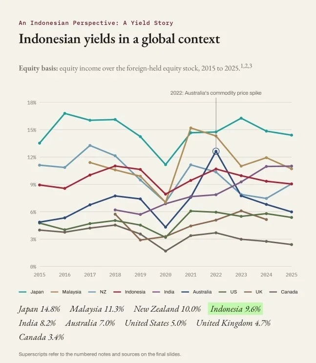
Income yield on equity, averaged 2015 to 2025:
- Japan14.8%
- Malaysia11.3%
- New Zealand10.0%
- Indonesia9.6%
- India8.2%
- Australia7.0%
- United States5.0%
- United Kingdom4.7%
- Canada3.4%
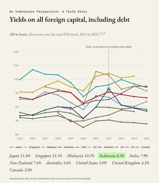
Include loans from parents to subsidiaries and Singapore joins at 11.1%. Indonesia sits fourth on either basis.
Going back over a decade, Indonesia's low point was 2020, at 7.9%. That exceeds Australia's average, and every year Canada or the UK has recorded since 2015.
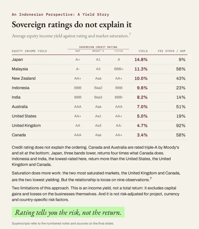
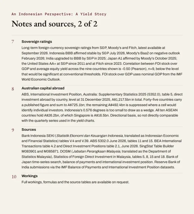
Sovereign credit ratings might have explained it. They did not. Canada and Australia are rated triple-A by Moody's and sit at the bottom. Japan, three bands lower, returns four times what Canada does. Indonesia and India, the lowest-rated of the ten, both return more than the US, the UK and Canada.
So where did the A$1.2 trillion go? The US holds 20%, the UK 14%, New Zealand 12%. Indonesia holds A$2.0 billion, 0.16%, a miserly share about one pixel wide on a phone-sized pie chart. New Zealand holds seventy-three times more. Papua New Guinea twelve times. Malaysia more than double.
Two limitations of the yield approach. It is an income yield, not a total return, so it excludes capital gains and losses on the value of the businesses. And it is not risk-adjusted for project, currency and other country-specific risks.
But the lack-of-returns explanation does not survive the data. Indonesia has delivered consistently for a decade, and ahead of the United States and the United Kingdom, which between them absorbed a third of everything Australia invested abroad. Whatever is keeping us out, it is not the yield.
Exhibits
Swipe or use the arrows. Select an exhibit to open it full size.